How to add search to your static website
One of the most important features that a website can have is a method to effectively search its content. There’s no denying that there’s such an overload of information on websites these days that helping people find what they need can be a monumental task. That’s where a well designed site searching functionality can swoop in to save the day and today I’m going to show you how to deploy this superhero feature on your very own static website, no backend required.
Now you’re probably saying to yourself “This guy barely has any content on his website… does he really need search
functionality? Can’t his visitors [sic] just hit Ctrl-F or ⌘-F?” However, you would be remiss in reminding
yourself that not all users are technical, nor do they all possess the appropriate number of digits required to
simultaneous press two keys. Then you might say to me “Hey buddy, your site is already indexed by google… Why can’t
your users just go to Google and search for what they want there?” to which I’d respond: please hold all your questions
and feedback until the end.
Now that we’ve clarified the why, let’s work on the how and jump right in! We know that Google is the king of search, so we’ll kick off this project by discovering what products they have available to solve our problem for us. We’ll do this by typing exactly what we want into google.com, clicking search, and then clicking on the first link. While you may choose to simplify the process with the I’m feeling lucky button, I find the added work of a multi-step process can often pay dividends in the feelings-of-accomplishment department.
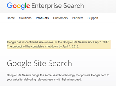
Straight out of the gate we’ll see that Google has a tool with a feature list capable of scratching our every itch: Google Site Search. However, before getting too excited it’s important to scan every Google product page for the ominous shutdown notice, and with our cursory glance we’ll see that our product is indeed deprecated. An unfortunate sight, but rather than being filled with disappointment we should consider the hours we might have poured into the ill-fated Google product had we been unaware of the impending shutdown.

Repeating our search again with “Google Site Search Alternatives” will lead us to another, slightly less spectacular solution: Google Custom Search. While lacking many of the bells and whistles of our first solution, it does provide search; and with the claims of basic configuration and a copy/paste installation, the setup process seems simple enough. Let’s give it a shot.
We’ll create a little spot at the top of our page for the <gcse:searchbox-only> tag, paste the cse.js loading
javascript snippet somewhere into the document, and away we go!

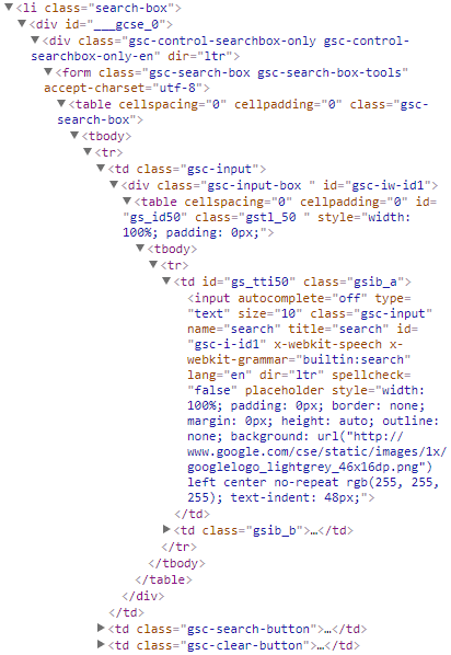
It’s a thing of beauty, isn’t it…? I figured it’d take some work to get it looking the way we wanted, but this thing just looks plain broken… Let’s dig into the DOM that was added to our site to see what created this monstrosity.

The first thing you may notice is that this thing was inserted directly into our page. No
shadow DOM (which is odd, considering Google’s
push for modern Web Components), not even an
iFrame; it’s just… out there. You may also notice this thing is still using all kinds of html tags (including the
classic table layout).
What’s wrong with the above? Well, many web designers these days use
CSS resets to start from a blank slate when creating their website. In my
case, I’m using Twitter Bootstrap which includes
Normalize.css (similar to a reset, but not quite), so when our site’s CSS
defaults cascade into the search widget we are left with something that most would describe as awful. At
Needle, while working on their in-the-page chat, I solved problems like this by using only
div tags wherever possible and namespacing all class names (e.g. <div class=".needle-h1">, which Google does do
here, luckily). Additionally, I created a container for our widget that instituted css defaults similar to
cleanslate.css which guarded against most cascading and universal selector issues that
could affect our widget. Since we don’t have control over the Google search widget in this case, we’ll have to find
another solution to this problem.
Google Custom Search touts customization, but looking at the customization panel will reveal that it’s mostly just color and font-size changes; and currently our search has a few more problems than a simple color problem. Let’s see if we can manually fix our problem and add some better styling while we’re at it.
// Just a little bit of styling...
.search-box {
  margin-right: 0;
  color: @gray-dark;
  position: relative;
  display: inline-block;
  width: 200px;
  border-bottom: 2px solid @gray-lighter;
  min-height: 30px;
  line-height: normal;
  a {
    font-size: inherit;
  }
  *, *:after, *:before {
    box-sizing: content-box;
  }
  .gsc-control-searchbox-only {
    border: 0 !important;
    padding: 0 !important;
    background: transparent !important;
    .gsc-search-box {
      margin-bottom: 0 !important;
      * {
        background: transparent !important;
        box-shadow: none !important;
      }
      .gsc-input-box {
        border: 0 !important;
      }
      input {
        color: @gray-lighter;
        border: 0 !important;
        appearance: textfield;
        border-radius: 0;
        text-indent: 0 !important;
      }
      td {
        vertical-align: bottom;
        padding-left: 0;
        padding-right: 0;
      }
      .gsc-search-button {
        display: none;
      }
      .gsib_b {
        display: none;
      }
    }
  }
}
With some javascript to clear the placeholder text and a slight smattering of !important tags we end up with something
that looks like it belongs on our site a little bit better:

A respectable looking search bar, if I do say so myself.
Normally I avoid the !important modifier like the plague, however in this case it becomes somewhat of a necessity due
to Google’s use of the style attribute to directly style some elements along with a few other
specificity battles involved with the process.
At this point some of you may be wondering what happens if Google ends up changing the html markup or styling of their widget… Couldn’t it end up looking even worse than it did originally? Couldn’t it end up looking something like this?
Yes, yes it could. However, it looks like that’s just the risk we’re going to have to take. Code doesn’t update that frequently these days, right? And it’s always backwards compatible when it does!
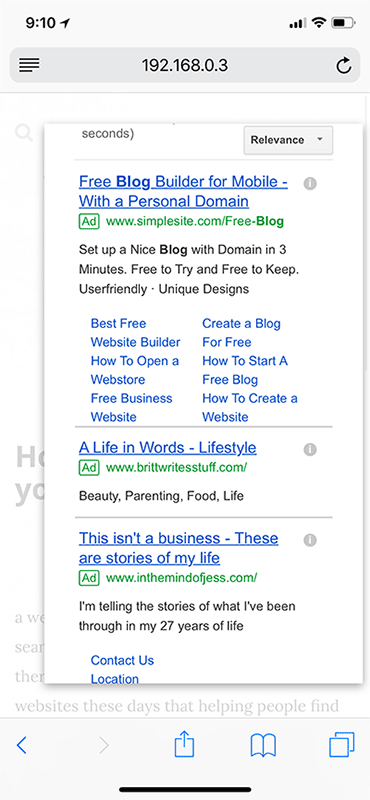
We haven’t checked out the search results page yet; I wonder what that looks like? Google Custom Search has a nice overlay option which means we don’t have to worry about where the results will fit into our page and it ends up looking pretty good on my desktop machine. Let’s see how it looks on a mobile device… It is 2018 and everything is responsive these days, so hopefully Google has implemented some sort of responsive behavior.

Optimistic as I was that we were almost done, it looks like we have a problem… In addition to looking pretty bad, the mobile results don’t scroll properly; and unfortunately for an overlay that decides to shove all the ads above the fold this basically renders our search results as a giant popup advertisement on mobile devices. Google Custom Search does have a configuration option that allows us to open the search results in a separate page… but then how is that better than just manually redirecting our visitors to a google search results page to begin with?
Wait, that’s genius! We can give our visitors the same experience they would have had with Google Custom Search (without any of the headache and third-party code inclusions) by just creating a search box that manually redirects them to a pre-populated Google search results page.
<template>
  <div class="google-search">
    <button @click="search(text)">
      <i class="fa fa-search"></i>
    </button>
    <input ref="input"
           title="Site Search"
           v-on:keyup.13="search(text)"
           v-model="text" />
  </div>
</template>

<script>
  export default {
    props: [
      'site'
    ],
    data() {
      return {
        text: ''
      }
    },
    methods: {
      search(str) {
        if (str) {
          window.open([
            'https://www.google.com/search?q=',
            this.site ? 'site:' + this.site + '+' : '',
            encodeURIComponent(str)
          ].join(''));
        } else {
          this.$refs.input.focus();
        }
      }
    }
  }
</script>
Simple, effective, and overall works well enough! It even has less ads, for whatever reason. I think we have a winner!
And that is how you add google search to a static website!
<view-source on="" />